


Why use Area under the curve? (AUC - ROC)
In my previous blog post, I introduced machine learning models and discussed some basic performance metrics, including AUC-ROC (Area Under the ROC Curve) and ROC (Receiver Operating Characteristic). In this post, I'll delve deeper into the importance of AUC-ROC, how to interpret it, and the underlying calculations.
AUC-ROC curves are a favorite tool of mine because they offer rich insights through visual representation. Often, I run multiple models and overlay their ROC curves to compare performance.
Imbalanced data is a common challenge. In such cases, one class significantly outnumbers the other. I'll focus on binary classification, where one class is considered positive, and the other is negative. This scenario is prevalent in medical data, like screening patients for a rare condition.
Imagine we randomly select 100 patients for screening for a heart condition. Statistically, given the prevalence of this condition, we expect that approximately 5 out of the 100 patients will genuinely have the heart condition. However, in reality, in this sample set, there are 6 patients who actually have the condition. The model predicts 5 patients have the condition, two of these predictions are patients that actually do not have the condition. There are 3 patients that are predicted to not have the condition but in reality they do.
Now, let's consider the model's predictions:
The model predicts five patients have the heart condition. This prediction consists of two components:
True Positives (TP): The model correctly identifies three out of the six patients who truly have the condition.
False Positives (FP): The model incorrectly identifies two patients as having the condition when they do not.
Additionally, the model predicts that 95 patients do not have the heart condition. This prediction consists of two components:
True Negatives (TN): The model correctly identifies 92 out of the 94 patients who truly do not have the condition.
False Negatives (FN): The model incorrectly identifies three patients as not having the condition when they actually do.
So, we have:
- True Positives (TP) = 3
- False Positives (FP) = 2
- True Negatives (TN) = 92
- False Negatives (FN) = 3
Now, we can evaluate the model's performance using various metrics:
Accuracy: Accuracy is a measure of overall correctness and is calculated as:
Accuracy = (TP + TN) / Total number of predictions.
Accuracy = (3 + 92) / 100 = 95%
This high accuracy score might initially suggest that the model is performing well.
Precision: Precision quantifies the reliability of positive predictions and is calculated as:
Precision = TP / (TP + FP)
Precision = 3 / (3 + 2) = 60%
The precision score indicates that out of all the patients predicted to have the condition, only 60% actually have it.
Recall: Recall (also known as Sensitivity) measures the model's ability to identify all positive instances and is calculated as:
Recall = TP / (TP + FN)
Recall = 3 / (3 + 3) = 50%
The recall score indicates that the model correctly identifies 50% of the patients who truly have the condition.
In this case, we have a high accuracy score, but the precision and recall are relatively lower. This suggests that while the model correctly identifies some patients with the condition, it also generates false positives and misses some true cases, leading to lower precision and recall.
The choice of which metric to emphasize depends on the specific goals and consequences of the classification task. In some applications, minimizing false positives (improving precision) might be crucial, while in others, ensuring that all actual positives are correctly identified (high recall) is more important. Evaluating the model's performance should consider the context and trade-offs between precision and recall, as well as other relevant factors.
Considering class prevalence is a crucial aspect of evaluating the performance of a machine learning model. Class prevalence refers to the distribution of the classes within the dataset, and it provides valuable insights into how the classes are represented. Let's delve deeper into why it's important:
Understanding Class Imbalance: Class prevalence helps us identify whether the dataset is balanced or imbalanced. In a balanced dataset, each class is represented roughly equally. For example, in a binary classification problem, if both positive and negative classes each make up about 50% of the dataset, it's considered balanced. However, in many real-world scenarios, datasets tend to be imbalanced, where one class significantly outnumbers the other. This is often the case in medical diagnoses, where the occurrence of the positive class is relatively rare.
Impact on Model Evaluation: The class prevalence has an impact on how we evaluate the performance of a machine learning model. With imbalanced datasets, accuracy alone can be a misleading metric. For instance, if 95% of the samples belong to the negative class, a model that simply predicts the negative class for all instances can achieve high accuracy (95%), but it provides little value because it fails to identify the minority class (positive instances).
Prevalence and Evaluation Metrics: Different evaluation metrics are affected by class prevalence in various ways. Metrics like accuracy, which consider all predictions, can be biased towards the majority class in imbalanced datasets. Precision, recall, F1-score, area under the ROC curve (AUC-ROC), and precision-recall curve offer more nuanced insights by focusing on specific aspects of classification performance, such as the ability to correctly identify positive instances.
Balancing Act: The choice of which evaluation metric to emphasize should align with the problem's goals and the consequences of different types of errors. For instance, in medical diagnostics, missing a positive case (false negatives) can have severe consequences, so recall (sensitivity) might be a critical metric. In contrast, in spam email filtering, precision might be more important because we want to minimize false positives (flagging legitimate emails as spam).
Model Selection and Thresholds: Class prevalence can also influence model selection and decision thresholds. In imbalanced datasets, models may have a bias towards the majority class. Adjusting the prediction threshold can help balance precision and recall, depending on the application's requirements.
This leads us to ROC (Receiver Operating Characteristic) curves. ROC curves are powerful tools for assessing the performance of classification models, shedding light on how well they distinguish between different classes across a range of classification thresholds.
- Understanding the Axes: The ROC curve is constructed with the false positive rate (FPR) on the x-axis and the true positive rate (TPR) on the y-axis. These axes are pivotal in understanding how the model performs under different conditions.
- AUC-ROC and Model Comparison: The beauty of ROC curves lies in their normalization. The area under the ROC curve (AUC-ROC) is a normalized metric that ranges from 0 to 1. This allows for a fair comparison of ROC curves from different models, making it an invaluable tool for model selection. A higher AUC-ROC score indicates better discriminatory power.
- Interpreting ROC Curves: A well-constructed ROC curve should gracefully bend towards the top-left corner of the plot, which is positioned above the line of the chance or random classifier. This upward bend signifies the model's ability to differentiate between the classes across various threshold values. A curve that hugs the top-left corner closely suggests superior model performance.
- Threshold Tuning: ROC curves play a pivotal role in helping practitioners fine-tune the classification threshold. By adjusting this threshold, you can influence the trade-off between precision and recall. For instance, a lower threshold may increase the true positive rate but also lead to more false positives, while a higher threshold might reduce false positives but decrease true positives.
- Creating ROC Curves: To generate an ROC curve for your machine learning model, you'll typically use your test data and their corresponding labels. Libraries like scikit-learn offer helpful functions such as ‘roc_auc_score’ and ‘roc_curve’ to facilitate this process. The ‘roc_curve’ function provides you with the FPR and TPR values that you can plot to visualize the ROC curve. The area under this curve represents your AUC-ROC score, providing a quantitative measure of your classifier's performance.
False Positive Rate (FPR): FPR is calculated as the ratio of false positives to the sum of false positives and true negatives.
FPR = FP / (FP + TN)
Essentially, it measures the proportion of incorrect positive predictions out of all actual negatives. In other words, it tells us how often the model predicts the positive class when it should have predicted the negative class.
True Positive Rate (TPR): TPR, also known as sensitivity or recall, is calculated as the ratio of true positives to the sum of true positives and false negatives.
TPR = TP / (TP+ FN)
This metric gauge the model's ability to accurately predict the positive class when it is indeed positive. It's a key indicator of a model's capability to detect the true positive instances.
ROC curves offer a comprehensive view of a classifier's performance across a spectrum of classification thresholds. They empower you to make informed decisions about threshold selection, assess model discriminatory power, and choose the most suitable model for your specific classification task.
Creating the ROC curve
Creating an ROC curve is a fundamental step in evaluating the performance of a machine learning classifier. This graphical representation provides insights into how well your model distinguishes between different classes, and it's a valuable tool for model selection and threshold tuning.
Here's a more detailed explanation of the process:
- Data Preparation: To start, you need your test data, which are instances that your model hasn't seen during training. These data points should ideally represent a real-world scenario. Alongside your test data, you'll need the corresponding labels, which indicate the true class of each instance.
- Scikit-Learn Functions: Scikit-learn, a popular Python library for machine learning, offers helpful functions for working with ROC curves:
- roc_auc_score: This function calculates the AUC-ROC score, which quantifies the performance of your classifier. A higher AUC-ROC score indicates better performance.
- roc_curve: This function is essential for generating the ROC curve itself. It takes your model's predicted probabilities or scores for the positive class (often obtained using the predict_proba method) and the true binary labels as input. It then calculates the false positive rate (FPR) and true positive rate (TPR) for various threshold values.
- ROC Curve Visualization: After using the ‘roc_curve’ function, you'll have the FPR and TPR values at different thresholds. You can now plot these values to create the ROC curve. The x-axis represents the FPR, and the y-axis represents the TPR. Each point on the curve corresponds to a specific threshold. By connecting these points, you form the ROC curve.
- Interpreting the Curve: The ROC curve typically starts at the origin (0,0) and rises toward the top-left corner. A curve that closely follows the top-left corner indicates a model with excellent discriminatory power. In contrast, a curve that hugs the diagonal line (the random classifier) suggests a model that performs no better than random chance.
- AUC-ROC Score: The area under this ROC curve, referred to as the AUC-ROC score, is a key metric. It provides a single value that summarizes the classifier's overall performance. AUC-ROC scores range from 0 to 1, where 0.5 corresponds to a random classifier, and 1 indicates a perfect classifier.
Generating an ROC curve can be done using scikit-learn functions like ‘roc_auc_score’ and ‘roc_curve’ to process your test data and model predictions. The ROC curve visually illustrates how your model performs across different thresholds, while the AUC-ROC score quantifies its overall performance. This information is valuable for assessing and comparing different classifiers and making decisions about threshold selection in classification tasks.
Metrics for example code, included below:
Number of predicted positives : 45
accuracy score : 0.828
prevalence : 0.805
accuracy : 0.828
precision : 0.756
positive predicted value : 0.756
negative predictive value : 0.831
True positives :34
False positives :11
True negatives :794
False negatives :161
False positive rate : 0.014
True positive rate (recall) : 0.174
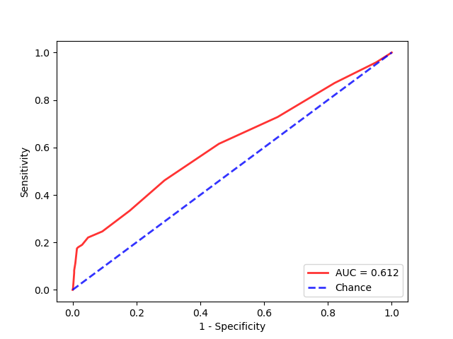
AUC score=0.612
From the metrics we see that the recall , TPR = TP / (TP+ FN) is only 17.4%. This is certainly not what I would expect from a model that has an accuracy score of 83%. From the ROC curve, it shows the model is better than chance but not much better.
Example code to test AUC – ROC and gather metrics:
# see : https://www.mlrelated.com
import numpy as np
import matplotlib.pyplot as plt

from sklearn.ensemble import RandomForestClassifier
from sklearn.metrics import roc_curve, roc_auc_score, accuracy_score, confusion_matrix

# roc curve and auc
from sklearn.datasets import make_classification

from sklearn.model_selection import train_test_split
from matplotlib import pyplot

VISUALIZE  = True

def calc_metrics(actual, pred_class):
    conmat = confusion_matrix(actual, pred_class)
    TP = conmat[1, 1]
    TN = conmat[0, 0]
    FP = conmat[0, 1]
    FN = conmat[1, 0]
    PPV = TP / (TP+FP)
    NPV = TN / (TN+FN)
    ACC = (TP + TN) / (TP+TN+FP+FN)
    return ACC, PPV, NPV, TP, TN, FP, FN


if __name__ == '__main__':

    # generate 2 class dataset, with noise and not balanced
    X, y = make_classification(n_samples=10000, n_classes=2, random_state=1,  weights=[0.95], flip_y=0.3)

    # split into train/test sets
    X_train, X_test, y_train, y_test = train_test_split(X, y, test_size=0.10, random_state=2)

    # fit a model
    model = RandomForestClassifier( n_estimators=20, oob_score=True,
                                        random_state=2, n_jobs=-1)
    model.fit(X_train, y_train)

    # predict probabilities
    probas = model.predict_proba(X_test)

    # keep probabilities for the positive outcome only
    preds = probas[:, 1]
    pred_class = (preds > 0.5).astype(int)
    acc_score = accuracy_score(y_test, pred_class)

    # create arrays for roc curve
    fpr, tpr, thresholds = roc_curve(y_test, preds)

    ACC, PPV, NPV, TP, TN, FP, FN = calc_metrics(y_test, pred_class)
    FPR  = FP / (FP + TN)
    TPR = TP / (TP+ FN)
    precision = TP / (TP + FP)
    prev = 1- np.mean(y_test)

    print('Number of predicted positives : ' + str(np.sum(preds > 0.5)))
    print('accuracy score : ' + str(acc_score))

    print('prevalence : %.3f' % (prev))
    print('accuracy : ' + str(ACC))
    print('precision : %.3f' % (precision))
    print('positive predicted value : %.3f' % (PPV))
    print('negative predictive value : %.3f' % (NPV))

    print('True positives :' + str(TP))
    print('False positives :' + str(FP))
    print('True negatives :' + str(TN))
    print('False negatives :' + str(FN))
    print('False positive rate : %.3f' % (FPR))
    print('True positive rate (recall) : %.3f' %(TPR))

    # calculate scores
    auc_score = roc_auc_score(y_test, preds)
    print('AUC score=%.3f' % (auc_score))

    # plot AUC curves
    if VISUALIZE == True:
        plt.plot(fpr, tpr, color='r', label='AUC = %0.3f' % auc_score, lw=2, alpha=.8)
        plt.plot([0, 1], [0, 1], linestyle='--', lw=2, color='b', label='Chance', alpha=.8)
        plt.xlim([-0.05, 1.05])
        plt.ylim([-0.05, 1.05])
        plt.xlabel('1 - Specificity')
        plt.ylabel('Sensitivity')
        plt.legend(loc="lower right")
        pyplot.show()

print ('end')- Comments
- Write a Comment Select to add a comment
To post reply to a comment, click on the 'reply' button attached to each comment. To post a new comment (not a reply to a comment) check out the 'Write a Comment' tab at the top of the comments.
Please login (on the right) if you already have an account on this platform.
Otherwise, please use this form to register (free) an join one of the largest online community for Electrical/Embedded/DSP/FPGA/ML engineers:
